Progress Report: The Evolution of Dashboards, Reports, and Visualizations
Defining Dashboards, Reports, and Visualizations
Dashboards, reports, and visualizations are crucial components for extracting actionable insights about an organization’s processes, progress, and performance. In this blog, we will be looking at the evolution of these tools and they’ve grown to be of such importance for businesses today. To understand the importance of these three tools, we must first simply define them.
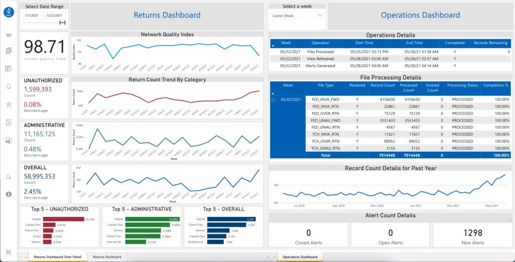
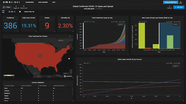
Dashboard: A dashboard is a tool used to answer specific questions about an organization using key information from different datasets presented in a centralized system. Dashboards use different forms of visualizations to tell a data-driven story, typically within a single screen.
Report: A report is an organized document created for a specific audience that presents detailed information about an organization (financials, sales, social media engagement, etc.) using tables, graphs, charts, and text. Reports can be broad in their scope of information, or they can be used to answer a single question.
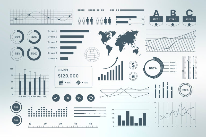
Data Visualization: Data visualizations are graphical representations of data and information. Data visualizations use visual elements such as charts, graphs, or maps to present information in a simple and accessible way.
A Timeline of Dashboards, Reports, and Visualizations
To understand where we are now in data analytics, we have to take our research back to the beginning. Humans have been using visualizations to communicate information since the beginning of time. Before the 17th century, the first data visualizations existed for maps to display geography, resources, and celestial bodies. For example, the Turin Papyrus Map is one of the oldest surviving visualizations from Ancient Egypt that we know of, created in 1150 B.C. by Amennakhte, an Egyptian scribe and government official. The map was drawn to represent a nine-mile view of Wadi Hammamat, featuring a stone quarry and gold mine. It was used for an expedition with the goal of bringing back stones to sculpt statues of gods, kings, and other notable figures of the time.
Then, in the 10th century, one of the earliest graphical representations of information comes into play: time-series graphs that show the changing positions of seven celestial bodies over time. The methods used to create these graphs later became refined in the 17th century, such as a vertical axis (y-axis) and horizontal axis (x-axis) divided into intervals, and the use of a grid similar to graph paper.
Data visualizations have always been necessary to convey information in a digestible way. Some of the earliest methods are still used today, while new methods are still being discovered. As visualizations evolve, the use for them does as well. Today, one use for visualizations is in dashboards and reports to show how a business is performing. Decision-makers use this information to constantly improve their business. Let’s look at how visualizations, dashboards, and reports have evolved over time and how they are used today:
The Trends of the Decade
The combination of visualizations, dashboards, and reports has given companies the power to truly understand the performance of their business and to be able to act on it. We’ve learned about how they have come to be, so let’s take a look at where they’re at now.
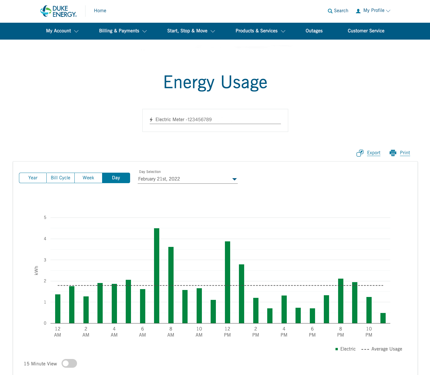
Real-Time Access to Data: An important tool of the decade is the ability to have real-time access to your data, as it flows in. Real-time access to your business\’s data has a significant impact on your ability to detect and address any issues that may come up as soon as possible. A common example of real-time data is your electricity usage. Many electricity companies give users the power to see exactly how much electricity they use in real-time. If a user sees a spike in usage, they can use that information to figure out why and how to fix the problem. Giving customers this knowledge greatly improves their experience by giving them a sense of control and transparency.
Data in Video: A recent trend is to utilize video to present information and visualizations. Studies show that we retain more information when it’s presented in a video. Participants in the study answered questions 323% better with a video aid compared to those who only had text instructions. In the same study, researchers found out that 67% of users prefer learning about new products or services through videos rather than just pictures or text. A good movie, YouTube video, or even a Tik Tok video can easily suck us in and we are excited to share what we find. The same goes for less exciting information, such as data for a business presentation. Humans pay attention to videos, and data is no good if no one wants to pay attention to it.
Data for Everyone: In the older days, data was very difficult to understand and to access. It required developers, data scientists, or other technical positions to retrieve and analyze. With the creation of advanced low code / no-code platforms, data becomes accessible to anyone and visualizations are easy to make. With the amount of data growing at a faster rate than ever before, it would be impossible to properly optimize it if access to it was limited. Accessible data means more opportunities for research, which means more opportunities for great discoveries.
Visualization Recommendations: A trend that David Winslow, Sr. Data Scientist at Wiweeki, has seen in recent years is that visualizations are automatically being presented based on the data itself. He states that “In the past, you had to define the set of data, like the price of gas for the last three years. You would have to figure out what is the best way to visualize this for the end-user so they see it. What I see happening now is that software is looking at the data itself and presenting it in the best way to represent that specific set of data. The software can analyze the dataset and figure it out for you.”
Interactive Data: The final trend in this list is interactivity. We have moved from static presentations of data to interactive sets of data where you can drill down into more information. It’s a starting point for you to start asking questions, or start interacting with your data. According to Mr. Winslow, the real advantage of interactivity is “To be able to converse with your data. Meaning, I ask a question and get some answer that leads me to ask more questions and I can do it without leaving my visualization. What used to happen is when you had another question, you would have to write a new report. You would have to query the data a little bit differently so that you can answer the new question. That was a time-consuming process. What the interactivity does is let’s you continue to ask questions about that data relative to the original data without having to run another report.”
What\’s In Store For The Future?
We asked Mr. Winslow, “What’s in store for the future of visualizations, dashboards, and reports?” to which he responds:
“The future would be to be able to interact with your data a little more seamlessly. Interactivity today is, you have a dashboard and it answers relatively narrow or specific questions and the dataset is fairly narrow. For example, if I was asking about gas prices, I could expand the data and look through all the gas prices, compare them, and ask questions about the prices and time periods, etc. But what I can’t do in that dataset is go to something that may be somewhat related but not exactly. For example, you could ask what the gas prices were in 2019 and you would get a specific response. Then you might ask, “what caused it to do that?” and now you have to stop the interaction because your dataset doesn’t give you that information. Or “Who won the Super Bowl the year the gas prices were $1.17/gallon?” Those two things are not related, so I think the future would be to continue the interactivity by linking it to more data. Expand the data to outside of just the gas prices or whatever your dataset may be. That would be the future, to expand the ability to take another path by first asking a question and then diverging into a different area and giving the user the ability to ask questions outside of the dataset they initially had questions about.
Interactivity in Loxio
Dashboards, reports, and visualizations mean nothing if they don’t have the data to populate them. Loxio is a self-service data analytics platform built by Wiweeki for the average business user. Loxio allows users to get a handle on their data by ingesting, enriching, and augmenting data from various data sources. With Loxio, users can integrate with the dashboard, report, or visualization tools that they prefer. The goal of Loxio is for users to be able to have a conversation with their data without having to leave the application. With data coming in from multiple datasets, users can continue to ask questions, gain actionable insights, and take action.
Learn more about Loxio.